Trivia 20 of 30
Which company pulled its new logo after just 6 days?
Even the biggest and most successful brands can botch it right proper.
In 2010, Gap had been suffering from several years of declining sales. To revitalize the brand, Gap North America president Marka Hansen worked with longtime creative partners Laird and Partners on a new logo. Roughly $100 million was spent on the campaign (onlykutts.com).
Backlash
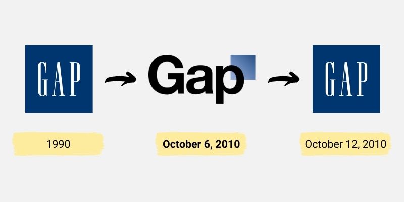
The effort to replace Gap’s 20-year-old logo fell flat on its face—rather immediately. Intense and unrelenting criticism flooded the internet from all around the world (cnn.com). Fans of the brand took to social media to express their displeasure with the new logo, which many felt was generic, unappealing, and not in line with the brand’s heritage (huffpost.com).
In an attempt to mitigate disaster, Gap tried to claim that the new logo was all part of a “crowdsourcing process” to help the company with its redesign and identity. The ploy didn’t work however, and Gap backed out of this regretful strategy almost instantly (bettermarketing.pub).
Pulling the new logo
Just six days after introducing the new logo, Gap was forced to backtrack and announce that it was scrapping its new design.

Gap’s 6-day rebranding boondoggle. Photo: onlykutts.com
As the old saying goes, “if it ain’t broken, don’t fix it.” Although sales had been down for a few years, the period leading up to 2010 was also a time of global economic recession. The brand itself was doing great. Customer loyalty and brand recognition were still high. Customers simply woke up one morning and one of their favorite brands looked completely different. In a bad way. Gap had not done anything to prepare people for such a change. There was no pre-launch campaign, nor a big announcement to unveil the new identity (bettermarketing.pub).
Within four months, Gap North America President Marka Hansen had resigned, acknowledging that the company “did not go about [the redesign] in the right way” (theguardian.com).
To this day, there hasn’t been a marketing blunder as quick, expensive, and outrageous as the Gap logo redesign (bettermarketing.pub).

