Trivia 8 of 30
What is an example of “leading” in graphic design?
Once upon a time, in the days of yore, before the internet and digital design software, there were printing presses. And with these printing presses came the need for a specific type of typography – one that was legible and easy to read at small sizes. This is where typesetting comes in (Wikipedia.org).
Today, digital design software and the internet have made it easier to create and use different types of typography, but the principles of legibility and visual balance remain the same, not to mention the unique terminology.
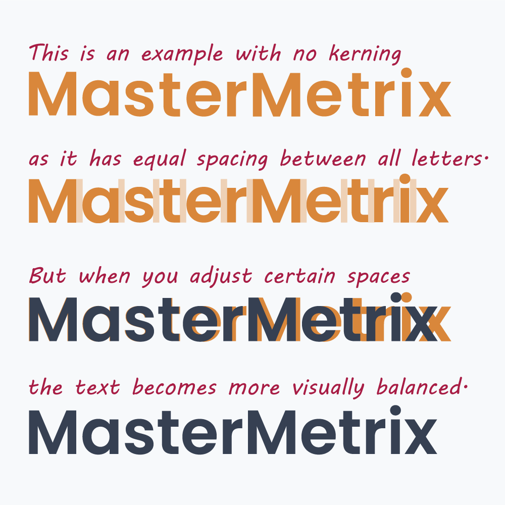
Kerning
Kerning refers to the adjustment of space between specific pairs of characters to make the text more visually balanced.
Leading
Leading is the traditional term for line spacing. The term originates from a time when physical spacers of various thicknesses, often made of lead, were inserted to adjust the spacing between lines of type (PracticalTypography.com).
Tracking
Tracking refers to the overall spacing between characters in a block of text. This is typically used to adjust the overall spacing between all characters for stylistic purposes.
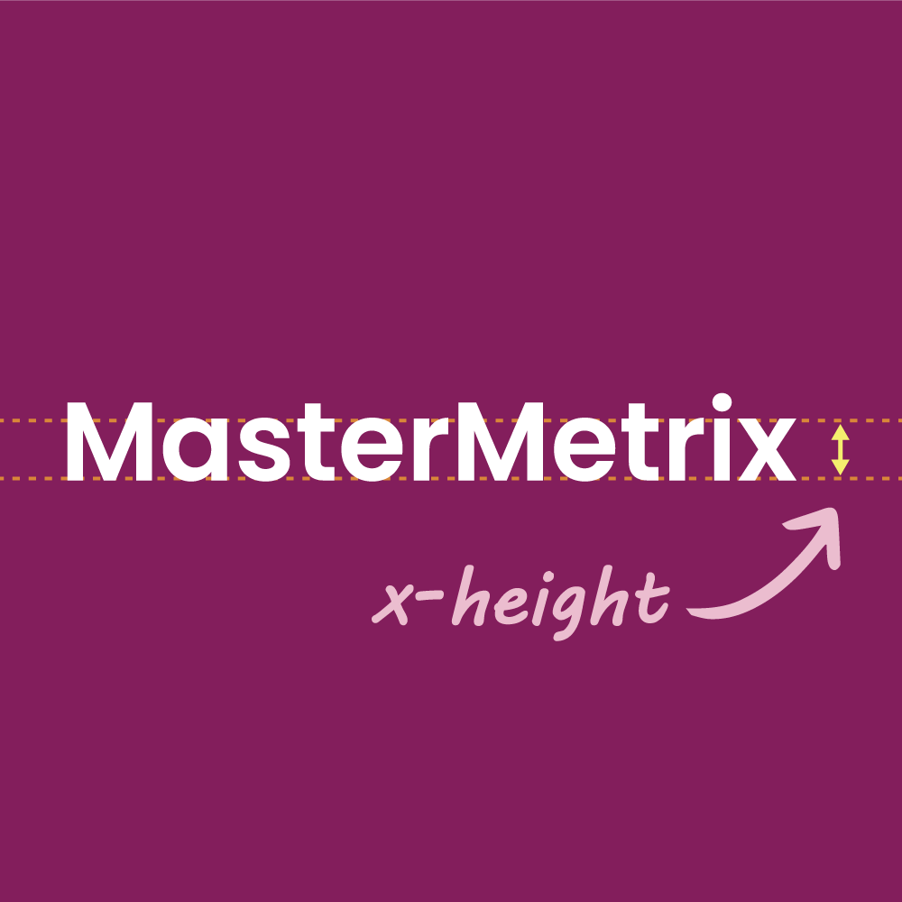
x-Height
X-Height refers to the height of a typeface’s lowercase letters.
Old fonts still used today
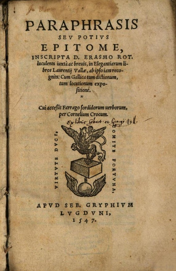
One of the oldest and most well-known typefaces used in printing today is Garamond. This font was created by French publisher and type designer Claude Garamond in the 16th century (Wikipedia.org).

Paraphrasis in Elegantiarum Libros Laurentii Vallae (1547), printed with a typeface called De Aetna, which is the precursor to Garamond.
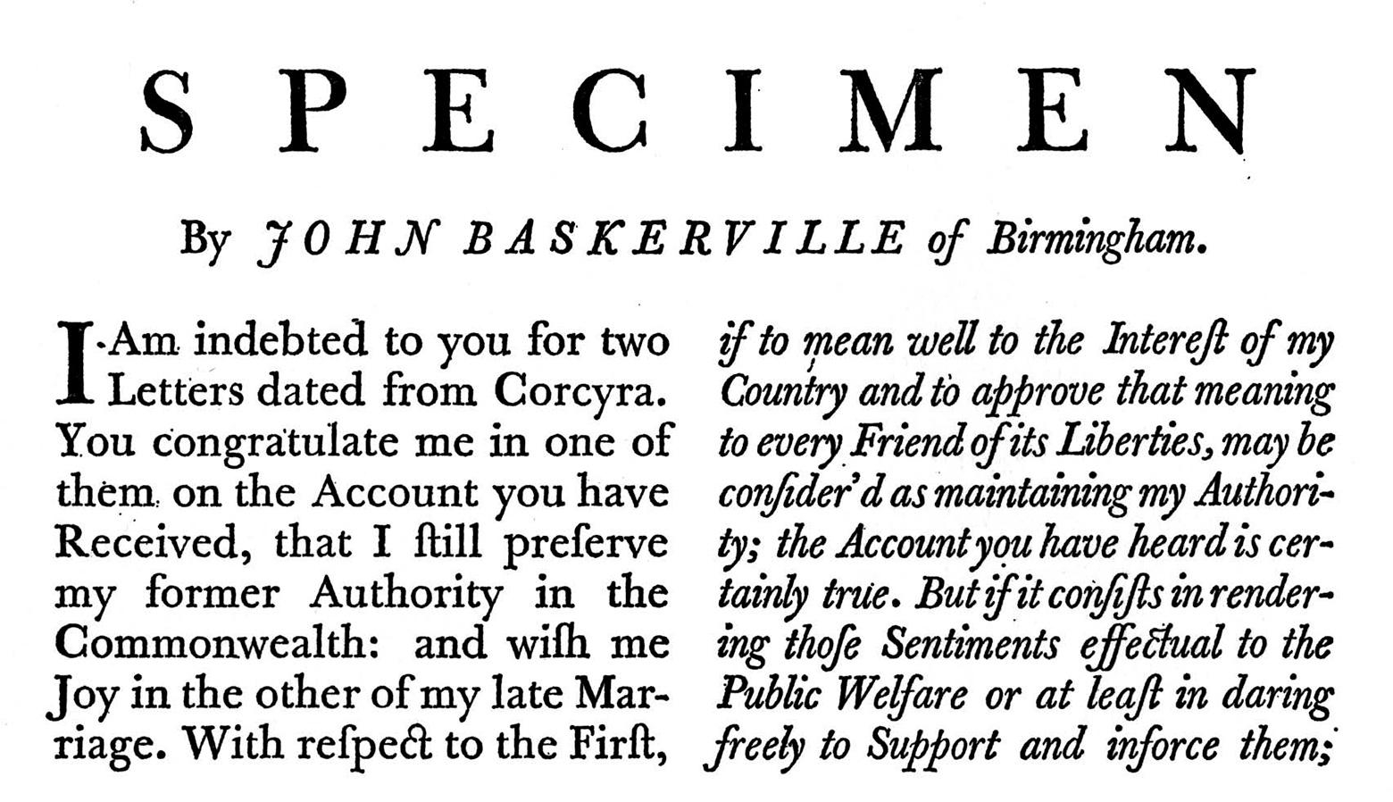
Another font that resembles the typefaces used in early printing presses is Baskerville, created by John Baskerville in the 18th century. Both of these fonts are widely available digitally and are often used in book design today.

A sample of text produced by John Baskerville in the 1750s to showcase his typeface. (Cameron Chapman)


